

Website Rebranding
& Redesign
A design intervention to increase lead generation for a new & growing chiropractic clinic located outside of Toronto
My Role
UX/UI Designer
Website Designer
Project Type
Website Rebrand
Background
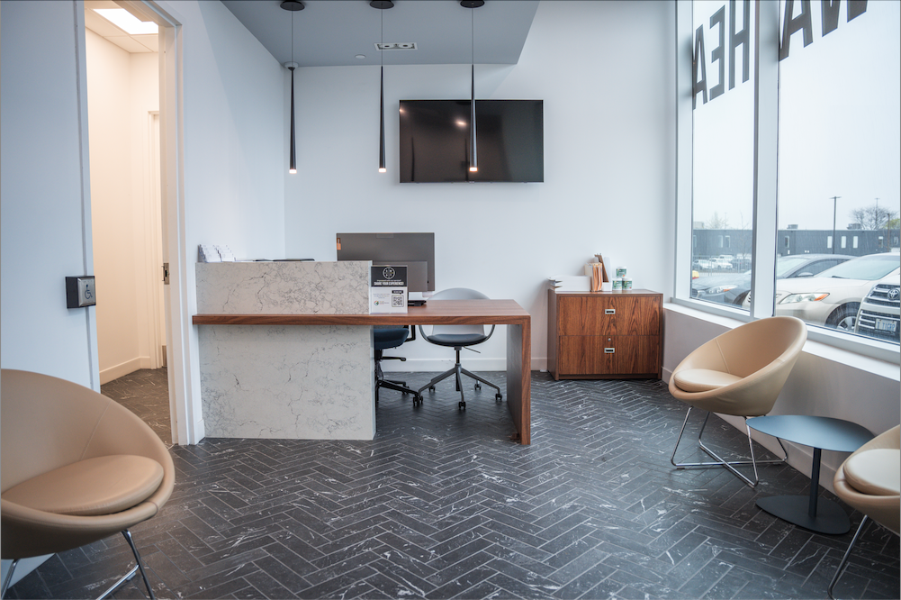
PEAC Health is a newly established wellness clinic located just outside of Toronto, offering a range of health services, including chiropractic care, physiotherapy, personal training, rehabilitation, and other wellness treatments. Since opening in August 2024, the clinic has been steadily growing its team and expanding its service offerings. However, to sustain this growth and establish itself as a trusted provider in the community, PEAC Health requires a strong online presence to attract clients, grow the business and stand out amongst competitors

The Problem
PEAC Health’s current website is incomplete and lacks a cohesive, professional design, making it difficult for users to navigate and fully understand the clinic’s services
Key UX issues—such as unclear navigation, missing service details, and weak call to action—are limiting user engagement, reducing conversions, and ultimately losing $$$ for the business
Project Vision & Goals
There's an opportunity to transform PEAC Health's website into a high-performing digital platform that effectively showcases its services, engages visitors, and drives more bookings
-
✅ Increased Engagement
Intuitive navigation and clear services information keep visitors engaged
-
✅ More Client Bookings
A compelling online presence builds trust and attracts new clients over competitors
-
✅ Higher Conversions
A seamless booking process drives more appointments, increased revenue & business growth
Persona Spectrums
Fact-based personas were developed by analyzing the clinic’s data records and patient trends. One core persona—the office worker—represents the average client, while two extreme personas—the competitive athlete and the retired senior—highlight opposite ends of the spectrum. This approach ensures a diverse range of user needs and considerations are accounted for in the design process
Persona spectrums were created to represent the same person in different contexts and situations to reflect real lives and challenges


How and why would a
user land the website?
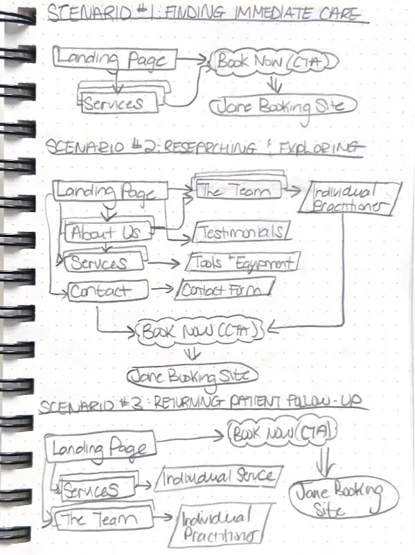
I came up with the top 3 most common scenarios for landing the clinic website, which served as the starting point for crafting the user flows
-
Scenario 1️⃣
User needs immediate care (urgent booking)
-
Scenario 2️⃣
User casually researching and exploring services
-
Scenario 3️⃣
Returning patient booking follow-ups
Activity Flows
For a wellness clinic like PEAC Health, the journey often begins with a search that directs users to the website's landing page. Here, we recognize the importance of strategically placing call-to-action buttons (e.g., “Book Online,” “Book Your First Session”) throughout the site to optimize conversions for all possible scenarios
The consistent CTA prompts encourage engagement and and guide users towards the Jane Booking system - this is our main goal!


Site Map
Gap Analysis
A gap analysis was conducted and revealed that a Blog section was missing—an opportunity to boost SEO, drive organic traffic, and enhance user engagement. A blog can position the clinic as a trusted authority while improving discoverability through high-ranking keywords and patient education.
However, with the current priority of launching the fully functional website, the blog is not urgent at this stage. It will be integrated post-launch to further strengthen PEAC Health’s digital presence and long-term growth
How content was organized
Since this was a newer project and required the creation and refinement of nearly all website content, a quantitative content audit was conducted using an organized Excel spreadsheet. Each piece of content was systematically listed along with key metadata (title, description, content type, intended user journey, etc.) to ensure clarity, consistency, and strategic alignment with the site’s goals


Wireframing with Purpose
To work efficiently, I started by mocking up the most critical pages first—Home, Services, Meet the Team, and Contact Us, to ensure the core structure and content hierarchy were solid before expanding to the rest
This allowed me to validate layout decisions early with the team before scaling the design further
My core checklist to drive conversions:
☑️ Clear & Consistent CTAs: Ensure every page has at least 1 "BOOK A SESSION" button to drive conversions
☑️ Build Trust: Affiliate’s logo section on the homepage to reinforce credibility + Google Reviews above the footer on each page
☑️ Encourage Engagement: Fillable forms for users to submit inquiries, clickable buttons (i.e. Learn more, View Services, Meet the Team, etc.) for client interaction and easy navigation

Iterating through collaboration


Design is never a solo process. Although I was the only UX/UI designer for this project, I worked closely with the clinic owner, developer and marketing team to explore different options, as well as receive & give feedback
We used WhatsApp for communication and weekly Google Meets Video meetings with the owner took place to ensure the design met the business and user needs
Bringing the iterations to life
With the core structure in place, the next big focus for the high-fidelity wireframes was making it effortless for users to take action—whether they were ready to book, researching services, or just exploring
Highly visible CTA buttons (i.e., “BOOK YOUR FIRST SESSION”, “SUBMIT FORM”) and strategically placed button links ("LEARN NOW”) were placed throughout the site to ensure that booking a session or engaging with the clinic is always just one click away. The inquiry form was also designed to help connect with potential clients, especially those who might have questions before booking


Designed for every type of client…
This prototype ensures an intuitive experience for all users:
☑️ New Clients can explore the site with simple navigation
☑️ Returning Clients can rebook in seconds
☑️ Occasional Visitors can quickly find appropriate care when they need it most
Revisions before going liive


Before hand-off, the dev and I were in constant communication and performed a QA over Figma to get down to the nitty gritty details and ensure the the design was consistent and aesthetically pleasing to eye
